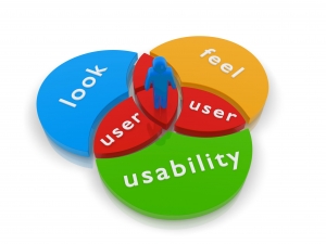
-
Useful
-
Findable
-
Accessible
-
Usable
-
Desirable
-
Effectiveness of the system
-
Is the system is easy to learn?
-
Is the system useful and adds value to the target audience?
-
Is Content, Color, Icons, Images used are aesthetically pleasing ?
-
Navigation required to reach desired screen/webpage should be very less. Scroll bars shouldn’t be used frequently.
-
Uniformity in the format of screen/pages in your application/website.
-
Provision to search within your software application or website
-
No outdated or incorrect data like contact information/address should be present.
-
No broken links should be present.
-
Controls used should be self-explanatory and must not require training to operate
-
Help should be provided for the users to understand the application / website
-
Alignment with above goals helps in effective usability testing
-
It helps uncover usability issues before the product is marketed.
-
It helps improve end user satisfaction.
-
It makes your system highly effective and efficient.
-
It helps gather true feedback from your target audience who actually use your system during usability test. You do not need to rely on “opinions” from random people.


